-
ChicagoArora, Namrata. "How Raja Ravi Varma’s Lithographic Press Shaped Hindu Devotion." Impart Perspectives, September 12, 2026. https://imp-art.org/perspectives/features/how-raja-ravi-varmas-lithographic-press-shaped-hindu-devotion/
-
MLAArora, Namrata. "How Raja Ravi Varma’s Lithographic Press Shaped Hindu Devotion." Impart Perspectives, Sep. 12, 2026, https://imp-art.org/perspectives/features/how-raja-ravi-varmas-lithographic-press-shaped-hindu-devotion/. Accessed 22 Sep 2026.
-
HarvardArora, N. (2026) How Raja Ravi Varma’s Lithographic Press Shaped Hindu Devotion, Impart Perspectives. Available at: https://imp-art.org/perspectives/features/how-raja-ravi-varmas-lithographic-press-shaped-hindu-devotion/ (Accessed: 22 September 2026).
How Raja Ravi Varma’s Lithographic Press Shaped Hindu Devotion
For over a century, Raja Ravi Varma’s mass-market 'god posters' have influenced how millions of people worship and imagine the Divine.
By Namrata Arora
Link copied!
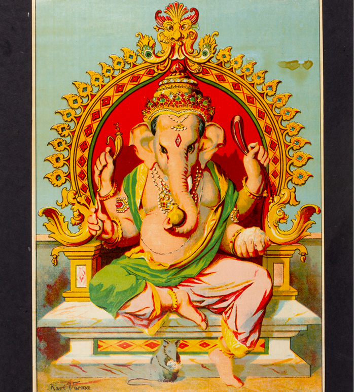
Ganapati; Ravi Varma Press; Chromolithograph. Courtesy Museum of Art & Photography (MAP), Bengaluru
Ever wondered why any illustration of Goddess Lakshmi seems slightly off if she isn’t portrayed in a red sari with a gold border and standing on a lotus? And why is it that we instantly associate Goddess Saraswati with an ethereal woman in a white saree, holding a veena and a book? Popular Indian iconography around Hindu gods is so ubiquitous that one rarely pauses to ponder about the ‘universal’ nature of such visual representations.
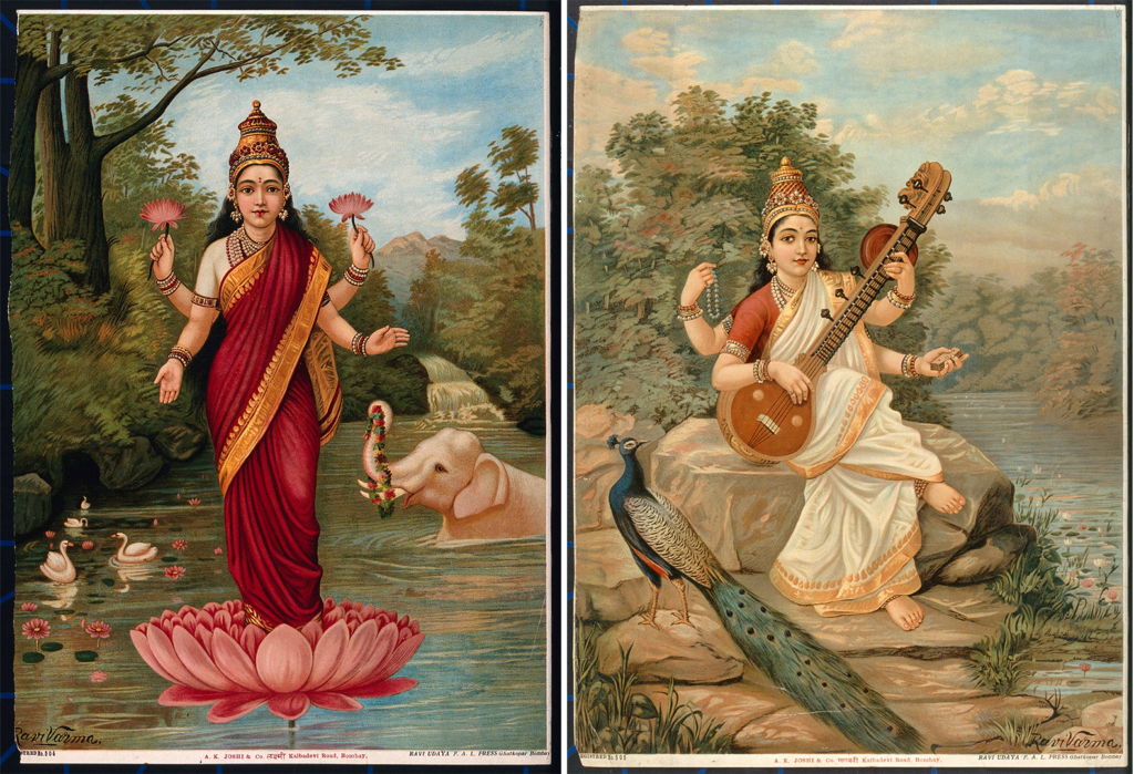
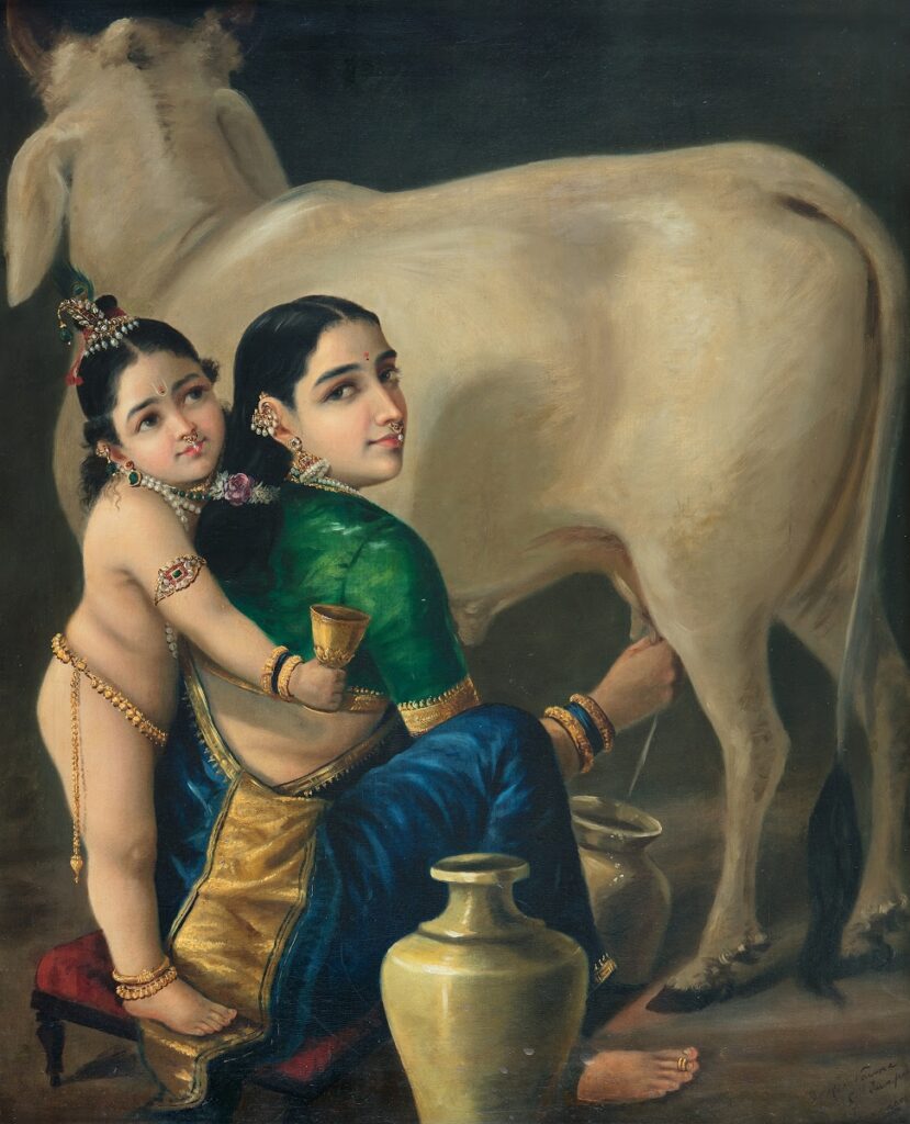
The story behind such instantly recognisable sacred imagery can be traced to the Ravi Varma Fine Arts Lithographic Press (Ravi Varma Press), established at the end of the nineteenth century. The chromolithographs printed by this pioneering press, founded by Raja Ravi Varma, would spawn a genre of religious prints that are so ubiquitous in the Indian cultural landscape that Professor Knut A Jacobsen, a leading scholar on South Asian religions, refers to it as the “god poster industry” in his 2004 essay. Identifying it as one of the most visible and prolific forms of popular religious culture in South Asia, Jacobsen remarks that “there is hardly a Hindu home, shop or workshop without one print or more on the wall or on the puja table.” The popularity of Ravi Varma-style prints is testament to how deeply connected such images are to how we imagine well-known episodes and characters from Hindu epics, such as Ramayana and Mahabharata, and religious lore and legends from the Puranas. The most widely circulated and iconic Hindu deity prints from the late 19th century onwards, such as Lakshmi standing on a Lotus (1894), Saraswati with the Veena (1894), Vishnu Garuda Vahan (1895–99) and Yashoda with Krishna (1895), were created by Raja Ravi Varma.
The genesis of the Ravi Varma Press can be traced to a letter dated 1884. In it, Sir Thanjavur Madhava Row, then the Dewan of the princely state of Travancore and a close friend and mentor, counselled the painter to send a few of his selected works to Europe and have them oleographed to meet the growing demand for his works. Previously, some of Ravi Varma’s paintings had become so popular that there were demands for copies, and he had to execute duplicates of his own artworks. Madhava Row predicted that well-executed prints, using the latest technology, would not only extend his reputation as an artist but also provide a “great service to the country.” It was in response to these suggestions that the Ravi Varma Press was eventually set up at Girgaum, Bombay, a decade later, in 1894.
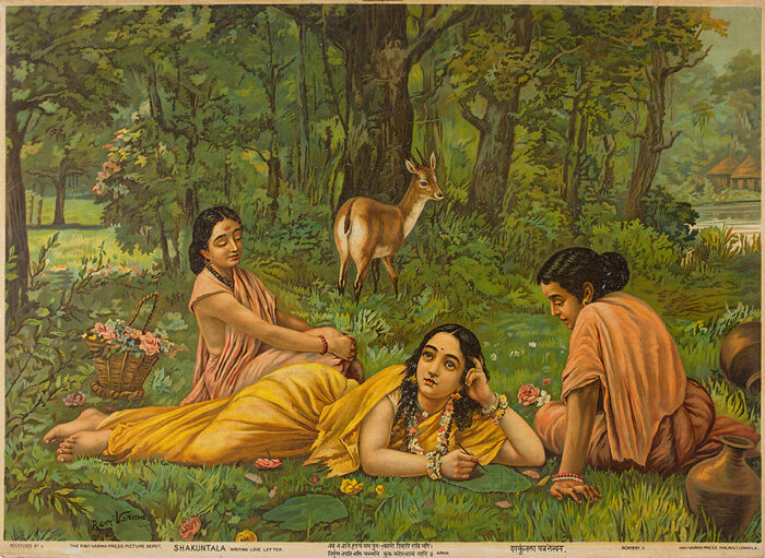
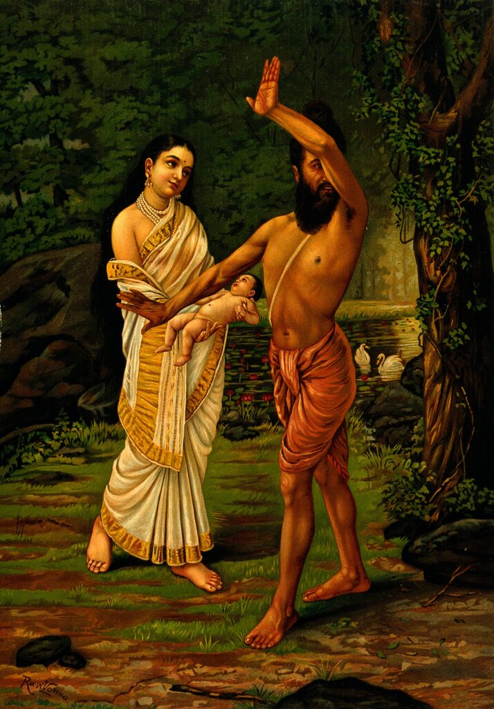
The largest and most innovative picture printing establishment of its time, the Ravi Varma Press operated on two steam-powered, high-speed lithographic presses that were especially imported from Germany and could produce 500 to 800 impressions per hour. In fact, the facility enlisted two German litho-transfer artists — Fritz Schleicher and Paul Gerhardt — to offer the required technical expertise to operate the imported machinery. As a result, the Ravi Varma Press soon earned an unrivalled reputation for its high-quality oleographs. The Birth of Shakuntala was the first chromolithograph rolled out by the press on July 12, 1894 and sold for Rs 6 a copy. While it was a substantial amount of money in colonial Bombay, it brought Ravi Varma’s art within the reach of the middle class. Later, chromolithographs of Lakshmi and Saraswati were launched in September of the same year. Many of the prints produced by the press were reproductions of existing paintings by Ravi Varma and his brother, C Raja Raja Varma. Apart from this, artworks were specifically executed, featuring deities, popular nationalist icons, mythological narratives, and characters from classical Sanskrit literature, for reproduction in large print runs at the press.
But what was so special about these lithographs? Prints for the country’s domestic mass market, referred to as bazaar art, was not a new business idea. By the late 1880s, imported European prints, especially from Germany, featuring near-naked women in poses adapted from classical European art, had flooded India’s domestic print market. Indigenous presses, such as the Poona Chitrashala and the Calcutta Art Studio (both founded in 1878), were also producing coloured lithographs — both secular-themed illustrations as well as ones depicting Hindu deities. However, Ravi Varma believed that the religious pictures that dominated the print market were atrocious and needed to be challenged, preferably through his own oeuvre of more refined, academic-style chromolithographs.
Indigenous presses before the establishment of the Ravi Varma Press conformed to descriptions in scriptures and deities were often rendered as flat, two-dimensional and expressionless figures. Art critic Partha Mitter quotes Balendranath Tagore, a contemporary writer and critic of late 19th century Bengal, who had noted, at the time, that the imagery in such bazaar prints failed to evoke “feelings of religious awe” because they sidelined the tenets of naturalism and literally adhered to Sanskrit metaphors. Tagore referenced the pictures produced by the Calcutta Art Studio, in which a symbolic pale yellow hue was used to depict Chaitanya, while an intensified application of blue was used for Krishna’s complexion. He also found the depictions of Goddess Kali “expressionless”, and the generous use of dark pigment to depict the goddess both “ugly” and “irritating”.
In contrast, Tagore had a more favourable opinion of Ravi Varma’s art. According to him, the painter’s compositions were suffused with “bhava” and portrayed the inner feelings and emotions of his supernatural subjects. While bhava was a Sanskrit literary term, in this context, it also evoked the idea of ‘naturalism’ in art — a highly regarded quality within European aesthetic traditions and the reason why Western art was seen as superior to Indian art. Tagore’s final unfinished essay on Ravi Varma (1899) reveals that he grew less enamoured of the artist’s Western Neoclassical techniques and academic realism. But for the general public, the bhava or sentimentality of Varma’s “god posters” made Hindu deities easier to worship because they naturally evoked the intense emotional pull (bhakti) a devotee was supposed to feel.
Ganesh V Shivaswamy notes that through Ravi Varma’s prints, God was created in the image of man. No longer were the images of mythic figures symbolic renditions or exaggerated and otherworldly figures. The Ravi Varma prints conveniently displayed Indian mythic subjects in the favoured Western realist style, bridging the gap between the human and the Divine. Christopher Pinney, in his chapter on ‘Lithographs and the Camera in Bombay and Delhi, 1890-1925’, notes that Varma’s style endowed Indian deities with a sense of tangibility and presence, making them appear more immediate and accessible. He writes, “Perspective and the convention of realism did not render the gods absurd or archaic: they made them more present.” Varma’s compositions also subtly diverged from older depictions with details that drew the viewer in. For instance, not only did he give Saraswati a three-dimensional form in his composition, he also depicted the goddess extending one of her hands holding a book out to the viewer, as if bestowing a gift or blessing. This was in contrast to earlier images and sculptures that would depict additional arms behind the body of the deity. Another deviation was swapping the swan with a peacock as the goddess’ mount. Ravi Varma prints would become so popular that such deviations and details would be faithfully recreated by artists in the prints produced subsequently by other presses. Over time, this had a homogenising effect on widely-circulated poster art of gods and mythological figures that led to the development of a fairly uniform template for Hindu imagery in popular culture.
In the early years of the Ravi Varma Press, its high-quality but moderately-priced oleographs travelled across socio-economic barriers of class by rupturing the distinction between low brow bazaar art and high brow original paintings. During Ravi Varma’s lifetime, commissioning art or collecting original works was meant for society’s elites. Paintings by renowned artists, especially oil paintings, were hung for display in private collections, royal galleries, palace halls and estates. In contrast, the common man could only look at original artworks if a public art event or exhibition was organised. But prints of Ravi Varma’s paintings made ‘high brow’ art affordable, accessible, and attainable. Ordinary people could aspire to possess the print of the same painting that hung on a wall in Laxmi Vilas Palace in Baroda, for instance. By the 1900s, there was already a large network of traders and “picture merchants” who sold chromolithographs, and Ravi Varma prints of Hindu deities would rapidly achieve pan-Indian popularity through them.
Ravi Varma’s prints also challenged deeply-embedded and rigid societal restrictions that barred so-called ‘impure’ castes from touching or praying to deities through intimate rituals of worship. In 1894, even access to places of worship was severely restricted and religious rituals were solely the domain of Brahmin priests. It was only after the 1936 Temple Entry Proclamation of Travancore that temples began to be opened to the masses. But thanks to Ravi Varma Press prints of Lakshmi, Saraswati, and other Hindu deities, access to the gods had already been democratised to an unprecedented level. These prints were central to many domestic altars with ordinary people aspiring to recreate the temple in their own homes and shops. With the circulation of Ravi Varma’s deity images, the societal-level centrality of the temple in Hindu religious practices diminished. Sacred imagery could no longer be held hostage by exclusive Brahmanical privilege.
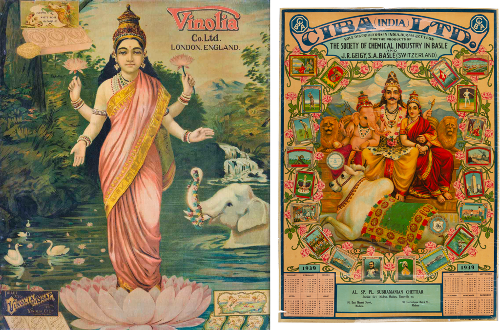
The legacy of Ravi Varma prints continued to flourish, even beyond the twentieth century, shaping commercial culture, nationalist politics, and popular media in ways that were both enabling and limiting. In 1903, when Fritz Schleicher took over the charge of the press, the range of print products was extended to include posters, textile labels, postcards, advertisements, and illustrations for matchboxes and calendars. For instance, goddess prints were used to advertise Vinolia luxury soaps, while Ravi Varma’s iconic Vishnu Garuda Vahan was used to extol the goodness of strawberry and apricot jams. But even blatantly commercial agendas could not alter the inherent reverence that these images inspired. Kajri Jain notes in her book Gods in the Bazaar: The Economies of Indian Calendar Art that pictures would be cut out of commercial calendars, labels and packaging, before being framed, and placed in prayer niches, gaining a second life as devotional objects — a practice that continues in modern times.
The aesthetics of these prints surfaced again during the formative years of Indian cinema and, subsequently, in other manifestations of dominant popular culture tinged with Hindu-flavoured nationalist and patriotic sentiments. Examples range from the immensely popular Amar Chitra Katha comic books for children and mythological Hindi-language TV serials such as Ramanand Sagar’s Ramayan (1987-1988) and BR Chopra’s Mahabharat (1988-90), which emptied streets during their original broadcasts.
Undoubtedly, the enduring legacy of the Ravi Varma prints should be celebrated but not without also examining some of the darker aspects of its influence. Art historian Vidhya Dehejia argues that it was Ravi Varma’s prints that actively constructed fair skin as the feminine beauty standard in popular Indian visual culture. Ironically, neither Raja Ravi Varma’s mother or mother-in-law was fair-complexioned nor were his wife or sisters. Despite this, Varma reproduced colourist Western aesthetic ideals by painting fair-complexioned goddesses and heroines and dark-skinned villains and servants. Even within his family, Varma would pick his older daughter to model for his paintings because she had a fair complexion compared to his dark-skinned second daughter. Ultimately, because his art had a major influence on the subcontinent’s popular culture, damaging cultural stereotypes around skin colour were normalised and this strongly contributed to the Indian obsession with fair skin.
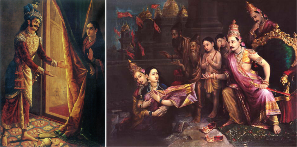
Similarly, Tapati Guha Thakurta argues that the prints of Ravi Varma Press, through its sanitised depictions of mythic heroines, contributed towards the construction of the ‘ideal’ Indian woman who was a paragon of virtue — self-sacrificing, maternal, loyal to a fault when it came to her husband, and pious. She further states that since many of these oleographs were based on mythic episodes where the chaste heroine is subject to male voyeurism, the circulation of these bazaar prints whetted the male gaze.
Beyond this, in the context of the anti-colonial struggle of the mid-twentieth century, the visual vocabulary of these popular, mass-produced prints was co-opted to express nationalist sentiments. For example, the women in prints derived from paintings such as Sita Bhumi Pravesh (1880) and Keechaka and Sairandhri (1891) functioned as allegorical illustrations of the female-coded nation (Bharat Ma) being oppressed by British colonisers, according to Pinney in his book Photos of the Gods (2004). Since Varma’s mythological art became intertwined with the freedom struggle, a fallout has been that patriotic and nationalist sentiment is often associated with majoritarian Hindu culture and politics. But, love them or hate them, it is impossible to be indifferent to Varma’s religious prints or the affect they instantly produce, having shaped more than a century of Hindu devotion.
First published: September 12, 2026