-
ChicagoSheikh, Nahal. "The Scripted ‘Aurat’: Urdu Typography & the Feminine Ideal in Pakistani Ads." Impart Perspectives, September 1, 2026. https://imp-art.org/perspectives/features/urdu-typography-in-pakistani-ads/
-
MLASheikh, Nahal. "The Scripted ‘Aurat’: Urdu Typography & the Feminine Ideal in Pakistani Ads." Impart Perspectives, Sep. 1, 2026, https://imp-art.org/perspectives/features/urdu-typography-in-pakistani-ads/. Accessed 17 Oct 2026.
-
HarvardSheikh, N. (2026) The Scripted ‘Aurat’: Urdu Typography & the Feminine Ideal in Pakistani Ads, Impart Perspectives. Available at: https://imp-art.org/perspectives/features/urdu-typography-in-pakistani-ads/ (Accessed: 17 October 2026).
The Scripted ‘Aurat’: Urdu Typography & the Feminine Ideal in Pakistani Ads
The calligraphic curves of the Nastaliq script and the linear discipline of the Naskh font serve as powerful visual metaphors in Urdu ads from postcolonial Pakistan.
By Nahal Sheikh
Link copied!
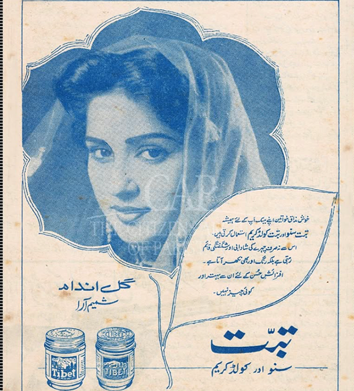
Tibet Snow Advertisement; Kohinoor Chemical Co. Ltd.; c. 1960s; Nigar Magazine. Courtesy The Citizens Archive of Pakistan (CAP)
The image of the modern aurat (woman) in postcolonial Pakistan has been a contested one — Who is she supposed to be? What are the ways in which she has been represented and what meanings reside within such representations? In the way there is no History with a capital “H” but histories, there has never been nor will there be a singular form of ‘Modernity’. After Pakistan was established as a modern nation-state, there were societal-level formulations and State policies aimed at creating versions of Muslim modernity that fit within religious, cultural, social, and political realities, in part shaped by colonial legacies. The construction of the feminine ideal in step with these negotiated, plural modernities was often embedded in particulars, such as socio-economic conditions, community-based values, and socio-political subjectivities. But, one broad way to study the intersections between modernity and womanhood in Pakistan is looking at the rich and layered visual language of its print culture, post-independence.
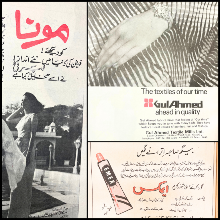
In the 1950s, the Islamic Republic of Pakistan was in the throes of developing a unified, national ethos — one that was domestically pious, yet globally relevant. An underdeveloped, primarily agrarian economy meant the nation had to pivot towards foreign investments and open up its domestic market to international brands during Ayub Khan’s rule (1958-1969). What followed was an influx of foreign goods, both from other parts of South Asia and countries beyond it — Lux soap, Colgate toothpaste, Tibet Snow, and Charmis face creams, among others. They were advertised through print ads in daily newspapers like The Daily Jang, Nawa-i-Waqt, Dawn, and magazines, such as Nigar, and Zaib-un-Nisa.
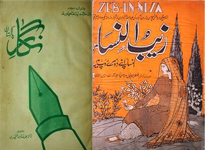
They were all targeting a very specific demographic in this young nation: the Pakistani aurat. How such cosmetic and personal hygiene products for women were marketed and how they tapped into the consumerism of a conservative society being transformed by economic liberalisation is a fascinating story. To begin with, companies had to think of ways to culturally integrate their products to suit Pakistani tastes and remain ‘unscathed’ by their foreignness. There was no better way to do that than localising the ads through Pakistan’s national language, Urdu.
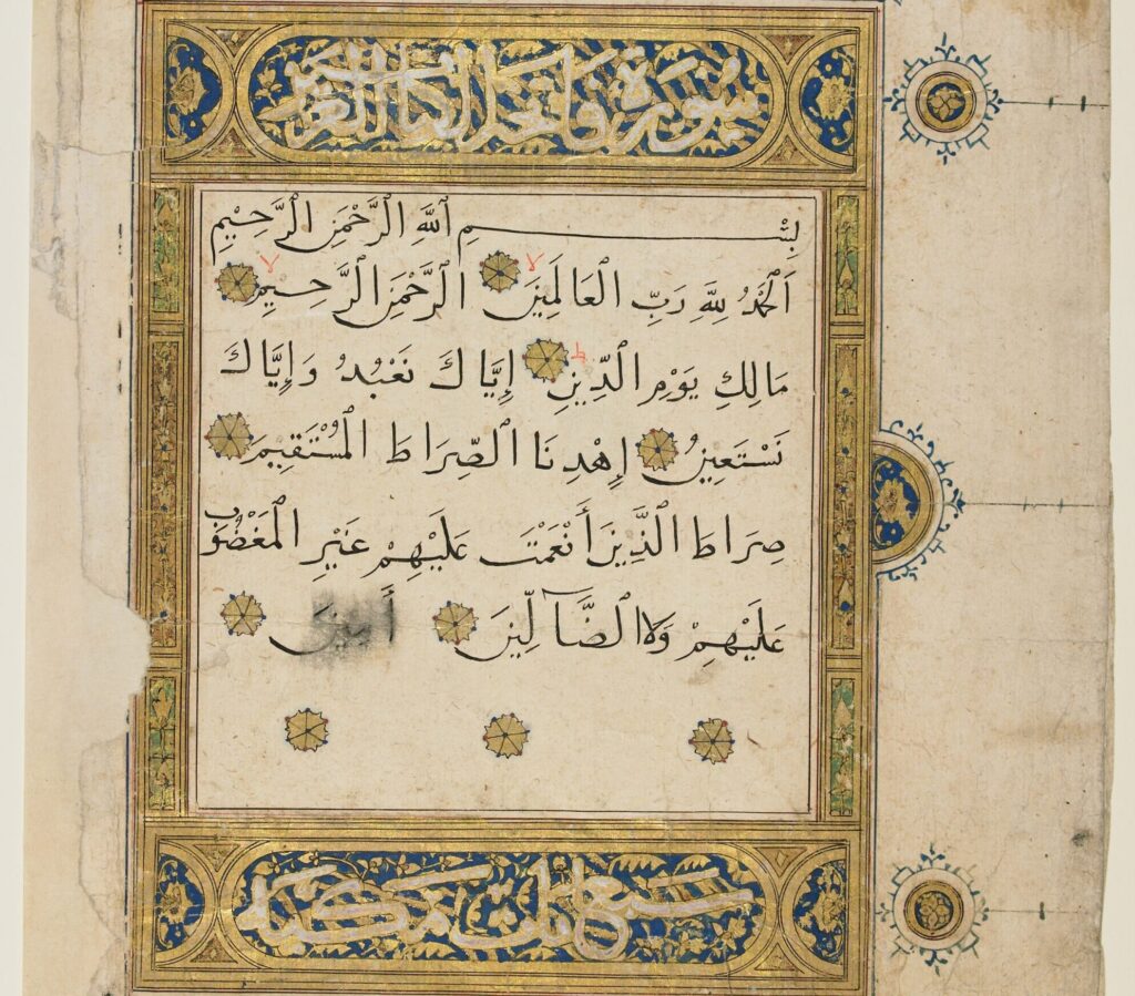
The Nastaliq style of Islamic calligraphy, a fusion of two predating styles — ‘Naskh’ and ‘Taliq’ — was formalised by the 14th century Persian calligrapher Mir Ali Tabrizi. Subsequently, this calligraphic style was adopted by the Mughal empire’s elites for its ties to Persian literary traditions and became symbolic of high culture and sophistication. It was associated with grace and beauty, and over centuries, became inextricably linked to the subcontinent’s Islamic culture and the Urdu language. Thus, the Perso-Arabic script was assigned heavy ideological weight in the making of Pakistan — what Tariq Rahman in his book Language and Politics in Pakistan (1996) calls “a conscious identity-building strategy” — by transforming it into a unifying symbol that attested to the foundational Islamic identity of the country.
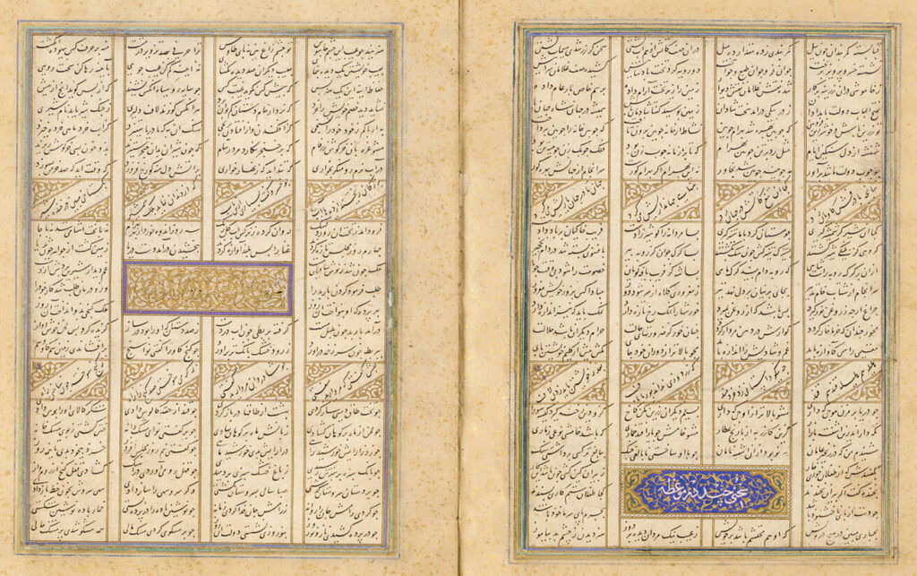
While Urdu’s role in Pakistan’s history is well established, the ideological work that its visual scripts did, is not. Typography itself is ideological. As Johanna Drucker argues in The Visible Word (1994), all written forms of language, including typography, “can only be understood in relation to the historical conditions of their production.” In Pakistan’s case, the use of certain typographical styles are tied to that specific period in history, post independence, when the country was actively constructing its identity through not only language, but also through the design of that language.
A viable font for Nastaliq, called ‘Noori Nastaleeq’, was deployed only in 1981. Before that, lithographic and offset printing techniques were used to reproduce handwritten Nastaliq text by calligraphers, with its diagonal rhythm and suspended flowing lines. Across printed media, it appeared most often in creative contexts, from Urdu literary publishing to print magazines. In contrast, Naskh, which was more straight and angular, was favoured in non-creative contexts. With several established fonts, the Naskh script was well-suited for fast, mechanical typesetting and printing; used by academic and governmental presses to print Qurans, scholarly texts, and official or technical documents and publications. Besides the issue of printing handwritten text vs mechanical typefaces, another reason for the separation in the use of these two Urdu scripts was that Nastaliq, regarded as decorative, embodied “artistic refinement and calligraphic sophistication,” according to art historian Sheila Blair, while Naskh “served functional clarity.”
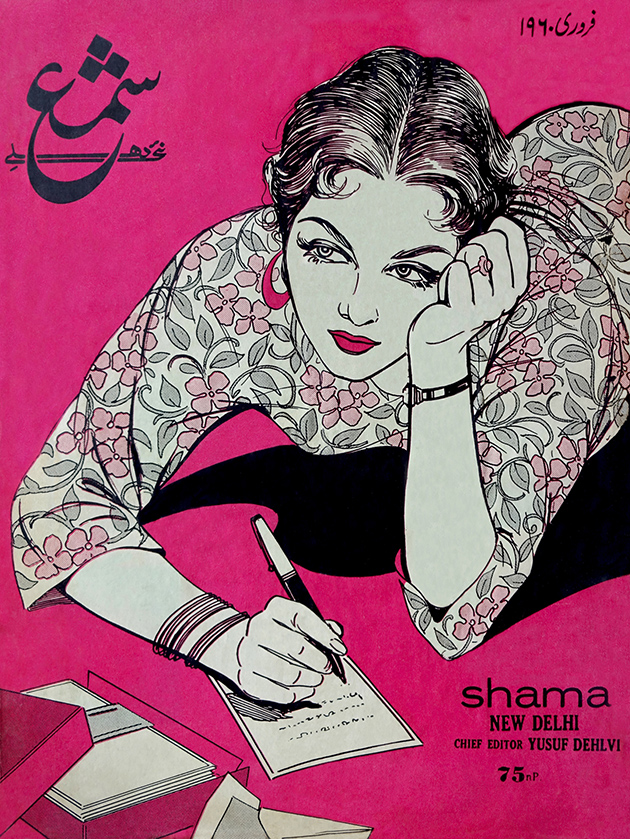
Urdu print magazines catered to a predominantly female readership, with many ads aimed at the ‘modern’ Pakistani woman. Some magazines offered leisure reading in terms of fiction, such as short stories and poems, while others were film magazines or reported on social issues and daily life. What remained consistent in the ads across all these publications was the promotion of a unique and new kind of modern consumerism, according to South Asian media scholar Afroz Taj. In his essay (2020), he analyses the popular Urdu magazine Shama, published in India but also widely-read in Pakistan, which he argues helped articulate “Muslim modernity” in South Asia. He references Yousuf Saeed’s research on the visual culture of early Urdu magazines to draw attention to the paradoxical nature of the ads in Shama and similar Urdu magazines, where the luxuries of self-care and aspirational nature of goods like Lux Soap (associated with film stars) was extolled and couched in the language of empowerment or desirability. But, all the while, ads also continued to reinforce women’s traditional and domestic roles in conservative households by highlighting new products that the modern woman could use to keep their husbands happy and get better at performing domestic tasks.
While the Nastaliq script was used in these ads, so was Naskh — visually grounding these ads in both styles. A manifestation of this typographic negotiation appears in a 1960s Nigar magazine ad for Tibet Snow skin cream. Manufactured in East Pakistan (now Bangladesh) but marketed using the Urdu language, Tibet Snow’s ad uses Nastaliq script to bridge regional fractures, illustrating how Pakistan’s plural modernities were flattened and streamlined across geography through media. Visually, its nature-inspired iconography incorporates the main image and body copy in a layout that forms a flower, stem, and leaf, wherein the woman in the ad invites a conversation with female readers of the magazine through her direct nazar (gaze). The body copy — declaring that “Happy women always use Tibet” — is situated within a leaf-shaped speech bubble, utilising natural diagonal ligatures and compressed spacing to evoke an intimate, woman-to-woman conversation; only this conversation is about capitalistic consumerism rather than social solidarities.
The brand mark “Tibet” is rendered in bold, authoritative strokes of Naskh to signify commercial confidence, juxtaposed against a softer, flowing subheading in Nastaliq that performs a ‘feminine’ rhythm of modesty. This cursive fluency visually mirrors the floral frame around her head that appears as a sanctifying halo. The promise is that cosmetic beauty will enable the performance of local aesthetics around feminine grace and flower-like purity.
Even though Nastaliq was privileged by the country’s publishing industry, and strongly linked to Pakistan’s cultural and literary heritage, the terrain of corporate print culture reveals typographic plurality and varied ways of using both scripts. For instance, in the 1960s print ads for Lux soap — a product of the British multinational Unilever — the Urdu translation of the brand name appears in a bold Naskh-style font alongside the illustration of the soap packaging stamped with the brand name in English. The overall effect of using the bolder Urdu script in this way is that it downplays the soap’s ‘foreign’ name and origin. Crucially, the subheading – “ab aur bhi zyada khushboodaar” (now even more fragrant) – shifts away from the cursive fluency of Nastaliq into a stylised, bold script once again, this time to compete with the use of the same slogan in English in large letters on the packaging.
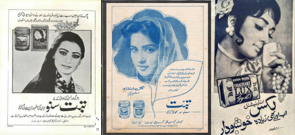
While the Tibet Snow ads used Nastaliq to create feminine rhythm, the illustrator for the Lux ad makes the material more female-coded by transforming the harkaat (vowel markers) above “khushboodaar” (fragrant) into miniature floral abstractions that visually perform the scent. This ornamentation mirrors the model’s white rose and pearl necklace, symbols of traditional virtue. The woman in the ad has a lowered, downward nazar (gaze) that avoids direct confrontation. Between the typography, illustrations and other visual elements, the ad balances modern consumerist desires with traditional values around modesty and restraint. This strategic use of Naskh with feminine visual cues demonstrates that Pakistani consumer modernity was never monolithic; it relied on the full range of Urdu’s diverse typographic lineage to influence women and stimulate demand for foreign and luxury cosmetic products within Pakistan.
The Urdu typography in these print ads was not just mediating culture but translating foreign modernity and patterns of consumption into something that looked and felt emotionally legible to Pakistani women in the 1950s-60s. Both Nastaliq and Naskh scripts — in different ways and in combination with other visual elements — were gendered to influence women as consumers and evoked very specific ideals for the Pakistani postcolonial aurat. She had to be open to modern ideas, technologies and products shaping the nation, but simultaneously cling to traditional, patriarchal values and modest behaviour.
It is within this tension between modernity and tradition that the “Modest Modern“ (author’s term) feminine ideal was born in Pakistan — an ideal that celebrated women in step with the times, who were educated, progressive and desirable, but who were also tractable and bound by cultural norms, assuaging masculine anxieties around giving women too much freedom or choices. The modern Pakistani woman had a public voice, the ability to direct her nazar, and access to a global market, yet her agency was contained. The calligraphic curves of Nastaliq clashing with the linear discipline of Naskh serve as visual metaphors in Urdu ads, representing the paradoxical ideas about modern womanhood in postcolonial Pakistan. Ultimately, the Modest Modern aurat emerges as a figure who is simultaneously liberated and disciplined through visual design.
First published: September 1, 2026