Our New Look

MAP Academy is now Impart
In 2022, MAP Academy began with an Encyclopedia and Online Courses on art in South Asia. Since then, we have grown into a more expansive platform for research, collaboration, inquiry, and public engagement. Our evolving offerings, audiences, and partnerships have broadened how we think about our work. This evolution has led us to express ourselves in a new way.
Our original identity was classical and minimal. We are now moving in a bolder and more modern direction, speaking to our increasingly diverse audiences and range of work.
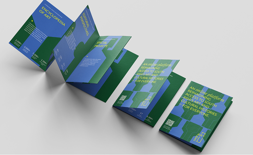
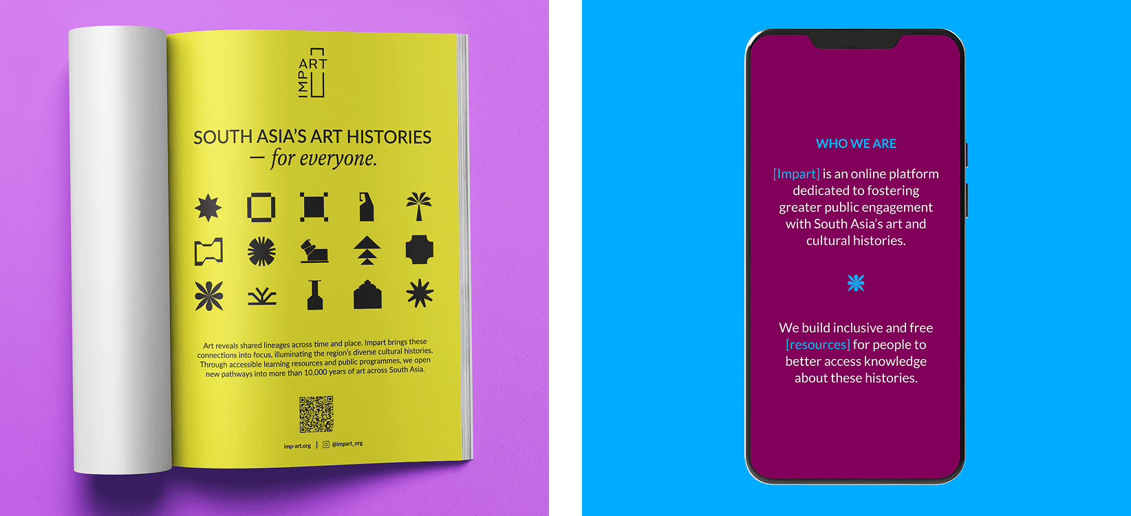
South Asia’s Art Histories — For Everyone
Impart reflects who we have become. Our new visual language draws from the intersection of two impulses that define our platform. One is a rigorous attention to context and detail, and the other is our encounter with the region's art itself — its colours, forms, rhythms — and the sense of discovery it inspires.
Our identity brings these strands together, balancing the discipline of research with the curiosity of exploration. It reflects a platform that is open, inviting, and committed to making South Asia’s art histories accessible to everyone.
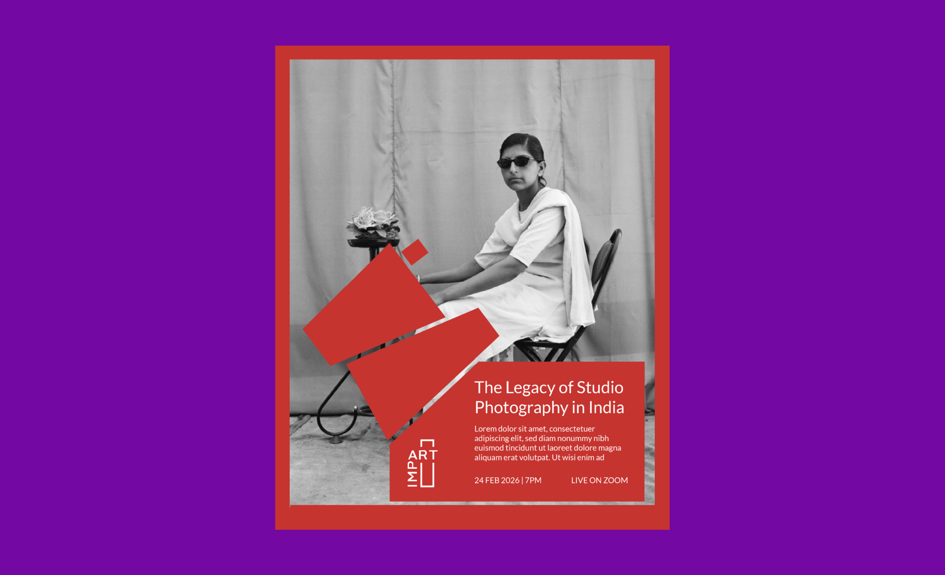
The Logo
At the centre of our new logo identity are the upturned citation brackets, which also reference frames that hold artworks. It transforms a familiar academic device into a clear visual form that reflects the way we locate, support, and share knowledge.
The brackets anchor the wordmark and reach beyond it, forming a flexible system that frames content throughout our platform. They give structure to information, guide the eye, and create emphasis, building a visual language that both contextualises and illuminates.
![]()
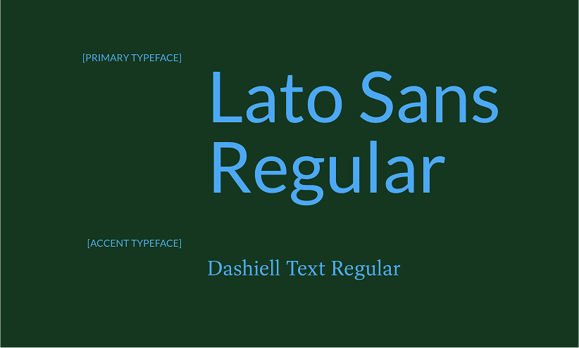
Typography
Type shapes how our ideas are read and understood. We chose Lato Sans as our primary typeface for its clarity and ease — contemporary, highly legible, and designed to carry longform writing across print and screen.
Alongside it, Dashiell acts as an accent. With its literary character and subtle expressiveness, the font introduces warmth and emphasis where needed.
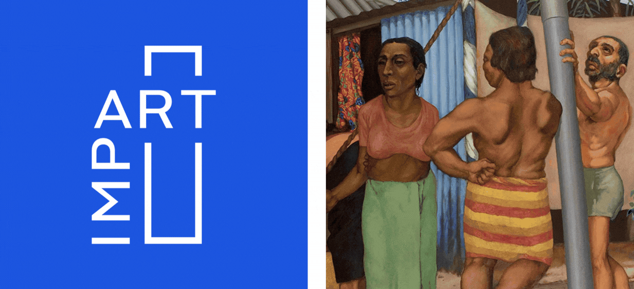
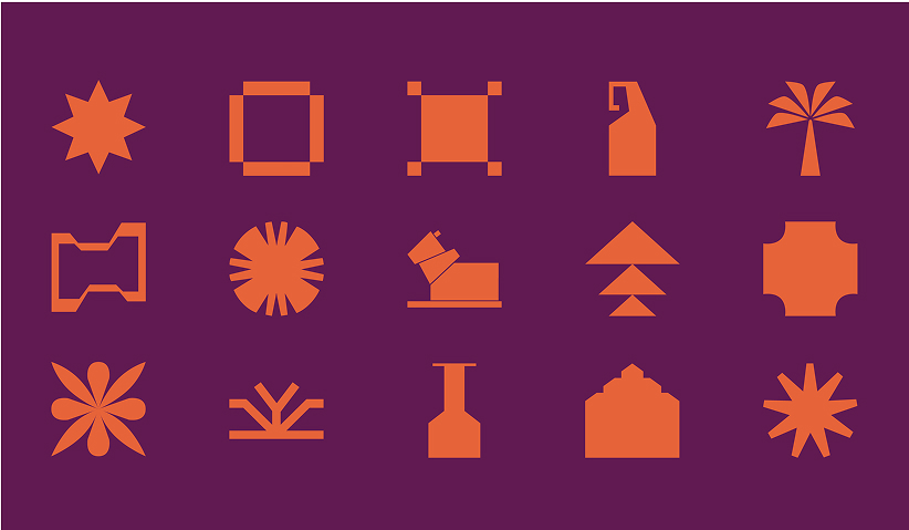
Colour & Form
Colour marks one of the most visible shifts in our identity. We've moved towards a brighter, more saturated palette — not simply to feel contemporary but to express the energy and range of the art histories we work with. The hues draw from the chromatic intensity and bold contrasts found across South Asian painting, textiles, architecture, and craft traditions.
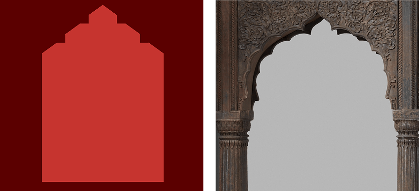
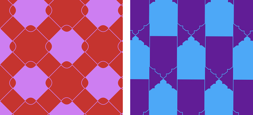
The forms accompanying these colors were built from careful observation. We looked closely at shapes and patterns found across art from South Asia — the curve of a paisley motif, the geometry of a jaali pattern, the symmetry of a charkha. These elements were abstracted and refined into a modular set of graphic forms, retaining a trace of their origins while functioning as flexible building blocks within a larger visual system.
Our New Identity
Together, these elements form our new visual language, designed to hold our ideas, research, and ambitions; a container for everything we do.
More than a change in appearance, this shift reflects how we approach our work — making shared knowledge on art more comprehensive, accessible, and nuanced. The system gives our platform clarity and consistency, while remaining flexible enough to grow with our projects and audiences.
A new frame for shared knowledge on art, with a stronger voice and a broader scope.
Learn more about Impart, and the work we do, here.